Last Updated: November 5, 2021
Some of the world’s most successful companies have become associated with their logos, in some cases eliminating the need to mention the title of their brand altogether. Even if you’re not Apple or Nike, a strong brand identity can differentiate your business from the competition, and that’s always a win! Developing your brand can make all the difference in the long run. Wayyy back in the beginning of COVID, a few of our team members took some time during lockdown to watch the series, Mad Men, and well, we were hooked! The iconic show focuses on the trials and tribulations of an advertising agency in the 1960s. It was fascinating to see the ideation stages back then. No computers, no apps, no Adobe Photoshop, no Illustrator, just a storyboard and some ideas (and quite a few drinks!) This process is in stark contrast to our modern-day landscape, where many businesses want bigger, better, faster, more, and often, cheaper too.
The Logo LifeCycle
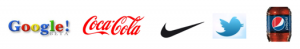
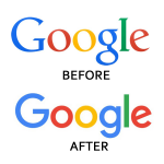
Company spend on logo design and rebranding campaigns varies widely, literally ranging from $0 to over $100M. That’s quite a range! Google’s initial logo was created on a free graphic program by co-founder Sergey Brin. Cost? $0. Coca-Cola spent $0 on it’s logo back in 1886, centered around the unique font of the two C’s and designed by their bookkeeper. The popular Twitter bird was a simple $15 iStock photo rights purchase. Nike originally paid $35 for the graphic design of their swoosh back in 1971. Pepsi paid $1 million for a redesign in 2008. Accenture paid $100 million for their rebrand from Anderson Consulting. We could go on and on.
Rebranding
Rebranding is very common practice for companies small to large, and may include slight or major alterations to a company’s logo design, typography, font and/or color, followed by website and print marketing collateral to complete the consistency of your visual brand. The process actually isn’t as daunting as it seems. Everything is based on the logo, and after that, the rest falls into place.
“93% of people say the “visual dimension” is the #1 influencing factor affecting the purchase decision.” (Source: Kissmetrics)
Maybe you need a clean, modern update to appear cutting-edge in your industry, or maybe you launched years ago and haven’t caught up to the modern times of typography, color and design, or maybe you’re experiencing some major organizational issues and wondering why your competition keeps winning the sale. Any of these reasons can mean it may be time to assess your visual brand. You can have everything in place working beautifully: a great reputation, a stellar team, organizational processes in place to streamline your business while offering the best value, services, products and ROI to your clients. This is all an essential part of your brand and very important. However, if your visual appeal doesn’t mesh or is outdated, it may be time for a rebrand.
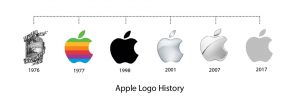
As you can see below, Apple has undergone numerous rebrands over the years.
10 Reasons You May Need To Rebrand
- Market Change: Often, a rebrand is needed just to remain competitive in your market, especially if it’s a fast-paced industry with growing competition. Even if your services are the best or you’ve been around the longest, you can get left in the dust if your brand does not visually connotate “cutting-edge” or at the very least, “modern”.
- Mission Change: If your organizational mission has changed, it may be time for a rebrand to portray your services accurately and tap into new audiences. Rebranding may be essential to ensuring your company is getting maximum exposure with the right demographics.
- Image Change: If your image is associated with negative, it is absolutely time for a rebrand.
- Team Feedback: You’ve received feedback from your team on your brand, and they’re embarrassed to hand out your business card or website address, it may be time to reassess.
- Brand Vision: Brand name no longer reflects your brand vision.
- Outdated Look: If your brand is so outdated that your competition is gaining all the traction, it’s time to assess and rebrand.
- Sea Of Sameness: If your brand looks too similar to competitors in the industry, you are not differentiating yourself from your competition and you will remain lost in a growing, homogenous sea of sameness. It’s important to assess and reposition as needed.
- Growing Pains: You’ve outgrown your brand. Maybe your company has expanded from local to national or from national to global. Your logo and your look need to encompass this.
- Audience: If you’re trying to connect with a new audience, it may be time for a rebrand.
- Pricing: If you’re struggling to raise prices, it may be time for a rebrand.
Why Do I Need to Rebrand?
“Research shows that 90% of information transmitted to the brain is visual, and visuals are processed 60,000 times faster in the brain than text.” (Source: Hubspot)
Logo design is important because it helps formulate an image in the viewer’s mind. Having the right “look” literally creates this important first impression, and helps build trust, which leads to credibility, which can lead to sales and increased profits. Even more importantly, your logo needs to articulate your true core brand as a business.
Fonts
Fonts are ever-changing and growing, as you can see by the logo changes below. Nobody knows for sure, but guesstimates total at least 300,000 fonts in the world. Choosing the right font can bring your brand up to date, and it could just mean a slight tweak. The right font can also accurately express your brand’s personality, where it stands today. While serif fonts can look traditional and professional (a serif is a small line attached to the end of a stroke in a letter or symbol, think Times New Roman), Sans-Serif fonts depict a more modern look. Many logos successfully incorporate both font styles together.
Color
There is a science behind logo colors. Our brains respond to the sensory language of color before we even process words or context. Yet, color is just one part of the story. The current trend is blacks, metallic and grayscale logos. These are successful because those major corporate brands have already been built, and are often recognizable without a mention of the name. (Think Apple, Uber, etc.)
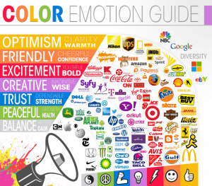
 There are also monochromatic color schemes that use color variations from the same color; primary color schemes that include the basics broken up by white or limiting an accent of color to one area; secondary color schemes which are the product of blending primary colors; tertiary color schemes that result from mixing a primary with a secondary color; analogous color schemes that combine a color with 2-4 adjacent hues; and complementary color schemes which include colors that are directly opposite on the color wheel. You don’t need to worry about any of this, a good designer will come up with your unique color scheme based on your Logo Design Questionnaire. Some industries tend to always use particular color combinations. Blues and greens are often associated with healthcare, while reds and yellows are associated with restaurant logos. The Color Emotion Guide below completely changes if we’re talking about other countries. but serves as a general guideline here in the U.S.
“Studies suggest that people make subconscious judgement about the product within 90 seconds of initial viewing, 90% of this assessment is based on color alone.” (Source: ColorCom)
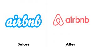
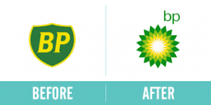
Examples of Major Corporate Rebrands

![]()
Think it may be time to rebrand? The clock is ticking. Fill out the Elev8 Consulting Group Logo Design Questionnaire to start your free assessment.